"[T]he genius of the map is what’s not on it. ... A map doesn’t have to show everything. It shouldn’t show everything. It has to have a reason, whether you’re driving around or you’re highlighting where things happened."
Listen
-
Episode Five: Maps
In conversation with Nancy Haack. Who makes sure you can find your way around a national park?
- Credit / Author:
- NPS
- Date created:
- 03/13/2020
Maps
NPS
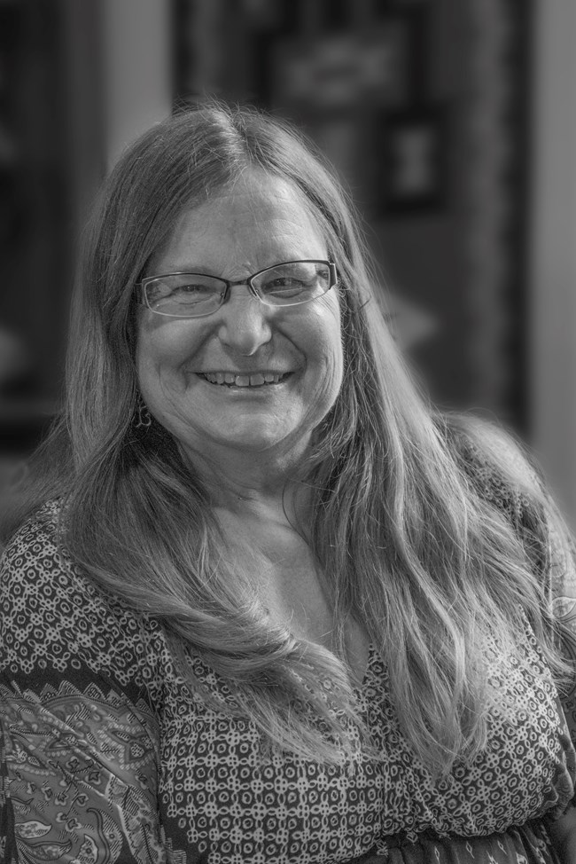
NANCY MORBECK HAACK (narrator): Some people will never be a map reader. They will never get the information. It’s not because they’re dumb. Their mind’s just not wired that way. So, it’s another thing we had to consider always with the maps we made because I think it’s even less than half of the population can successfully get the information from a map.
LU ANN JONES (host): That’s Nancy Morbeck Haack. She spent 34 years working with the National Park Service publications group at Harpers Ferry Center.
HAACK: Originally when I came, I worked on everything. You name almost any park that was around before 1970, I worked on it.
JONES: Over the course of her career, Haack researched and designed dozens of maps for the Park Service, but among her most lasting contributions was the impact she made on the philosophy of cartographic design and information within the NPS. That philosophy was grounded in childhood experiences.
HAACK: Even before I went to college, I loved maps. I read maps. I was what I’ve always called a “map head.”
We traveled all over the country when I was a kid, four kids in a station wagon; first time, no seatbelts. [laughter] Went to lots of national parks, and I usually got to read the map because I could.
Nobody taught me. It’s like people who are good at music—I understood it. I understood it right away.
I read Esso maps, Esso road maps, extremely clear and concise. They weren’t full of a lot of extra stuff, unlike Rand McNally or National Geographic maps. They worked, you got to where you needed to go, and they always were there. So that was always, in my mind, my standard of what a good map looked like.
JONES: I’m National Park Service historian, Lu Ann Jones, and you’re listening to “A Sense of Place: Stories of Stewardship from the National Park Service.” In this series, we’re diving deep into the oral history archives of the National Park Service, to bring you the stories of the people who shaped the parks, and the Service.
Today: Maps.
HAACK: Vince Gleason was the head of National Park Service publications at Harpers Ferry Center, and he really wanted to move forward in the design world with the brochures. I had even noticed as a kid and a young person that the brochures were all over the place--all different colors, sizes, shapes, style, even messages, because there was no centralized structure for them.
JONES: The problems with the existing park maps may have been imperceptible to the average visitor. They were certainly attractive, and detailed – but the question remained: could anyone actually read them? The consensus was: not really.
So, when Haack joined the Park Service in 1977, her primary objective was designing maps that focused on communication first and foremost. To do that, she’d had to consider the way regular people actually absorb information, and tailor her designs to their needs. Questions of orientation and labeling and how thick the lines should be were all driven by a single purpose: the need to communicate.
The most significant design switch involved moving to a four-color system.
HAACK: I was hired as a professional cartographer. Vince was very excited that he would have someone who could help on his path to this high-style, high-quality four-color maps. So, my job was to plan, design, and what we say compile, meaning collect the information for the map itself.
National Park Service [Washington, 1975, reprint 1976]
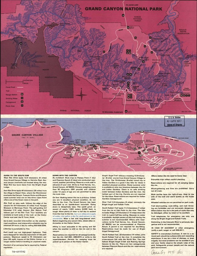
Vince used the maps as one of his justifications for four-color. Now, he wanted that for photographs, too, of course, because we had brochures that were orange and blue. I mean, really unattractive things. Purple. Purple water. My favorite thing is the purple water.
JONES: Haack had studied under some of the preeminent cartographers of the day at the University of Wisconsin. She’d learned the latest mapping technology as well as generalized cartographic theory. Among the most significant lessons she’d learned: that a map is a system of communication. Appearance is important, but design decisions have to be motivated. The colors, lines, the symbols – they should all cater to the way people actually think.
In other words: no purple water.
HAACK: Vince had his definite ideas, most of which were crazy. Because of the language of maps, he wanted the maps to look like the terrain. So, he wanted all the desert maps to look the same. If there weren’t trees, he wanted it to be brown.
I would show him examples of Yosemite. Yosemite, up in the northern or the highest parts of Yosemite, there weren’t any trees. Was he going to show that differently than Yosemite Valley? Now, this was way before all these aerial photographs are being used as maps. This was still when I felt very strongly that the parks had to be green. That’s what people expected. They saw green, they think park and they think National Park, because it was a National Park brochure. So that took a long time to work through that, to keep it simple. Red roads, green parks, blue water.
JONES: The shift to four-color maps prompted a whole other series of map standards. Standards Haack wasn’t fully prepared to implement on her own. She had trained in the philosophy of cartography, but not the philosophy of general publication design. For that, she teamed with the chief designer for park publications, Nick Kirilloff.
HAACK: He was looking for much more of a grace of form. When you put an area label on, for example, the computer or a person who had no training would just plop it on there, but he would position it so it covered the area that it was identifying and there was no mistake of what it was. I mean, that sounds so obvious. Cartographers had all sorts of rules about the first position, the second position, where to put a label according to a town dot, and he didn’t follow those rules. He went with what worked, how people could understand that that label went with the dot.
JONES: But aside from standardizing the width of lines, use of colors, and where to put the labels, the new park maps had a different approach to visual communication. A different way of thinking about the way the maps are used.
HAACK: The visitor-use map, it’s different than a map up on a wall, it’s different than a map in a book, it’s different than a map in an exhibit.
So, some parks are very welcoming. Other parks were pretty set in their ways. If it was a new map, it was easier to have a highly edited map, because the genius of the map is what’s not on it. We had a map done by a contractor of Mesa Verde and it showed the sewage lagoons. We didn’t need to show the sewage lagoons for the visitors, but it was complete. So that’s the sort of thing to think about. A map doesn’t have to show everything. It shouldn’t show everything. It has to have a reason, whether you’re driving around or you’re highlighting where things happened.
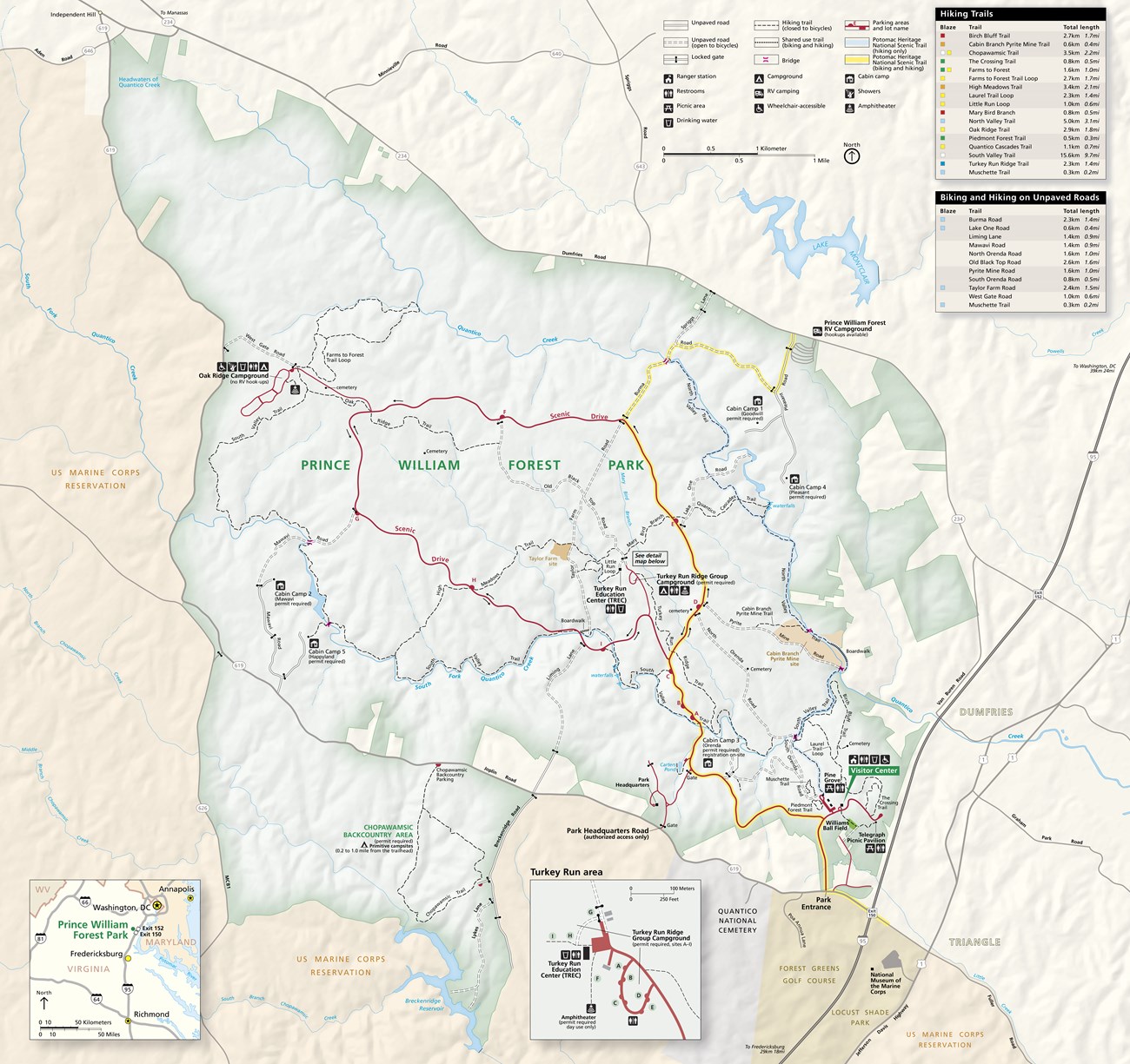
One of my favorite ones is constant requests for detail maps. So, I had to convince them that the public didn’t need to know where the ice machine was on the brochure map. That wasn’t the function of the brochure map. Usually when you were there, you looked around, you could see everything, so it was a waste of time and money, but people were so in love with maps, they thought that that was a solution. Of course, the percentage of people who couldn’t read the map, anyway, it didn’t reach; that information didn’t get to them. So, we still had detail maps that showed you where the ice machine is, but not as many.
NPS
Parking lot maps, yes, the famous parking lot maps that show you how to get to the Visitor Center. I’m sorry. We all go to shopping malls. We find our way into the stores, right? [laughter] So there are a lot of unnecessary maps.
JONES: Sometimes it took a bit of convincing park staff to see the value of a more selective approach--but only a bit.
HAACK: I think the proof was when they saw the map and they could read it. I think that’s what swayed them. So, there wasn’t a lot of “No, no, no” on my part. It was taking in all the information, creating the appropriate map.
JONES: The same standards applied to wayside maps.
HAACK: Once again, it’s a visitor-use map, so it has to be how they understand it. If you’re standing looking north, a north-oriented map is fine, or if you’re standing and the map is a big overview and you’re not really looking at anything, a north map is fine, but if you’re looking at something, the map better be oriented just as the vision is. And that’s been an ongoing fight, and I’m sure it’s still going on today. The people don’t get it. Like a trailhead, you want it to be going out and coming back as you’re looking.
JONES: Considering how each map would be used by the visitors assured there was no one-size-fits all approach to cartography in the parks. But it also assured that park visitors would always find them useful. Consider battle maps, which operate on a totally different organizational logic, and consequently, offer a different set of challenges.
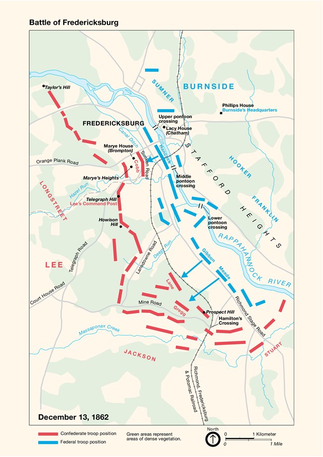
HAACK: There are many, many excellent battle maps out there, which most people, even map readers, can’t understand, and they don’t need to understand, right? We don’t need to know where so-and-so stopped and tied his shoe on the way to the left oblique or whatever. [laughs] But the Civil War buffs need to know that. That’s what the difference is. I ran into a lot of pushback from Civil War people because I didn’t want to have maps that looked like that. I wanted maps that would just briefly tell the big picture and move on. If somebody wanted to know where a particular regiment was, there are tons of maps other places. They don’t need it in the brochure map or even in an exhibit map that way. There are tons of places they can find that.
NPS
So, the whole thing was, once again, simplify, simplify. Our late great publications historian, Ray Baker, was excellent at summing up all—he knew all the little details, but he could sum up the big picture better than a lot of parks could, and that’s what led me to realize you could make a very simple map, what we would call multiples, small multiples or series of maps showing change over time, and it would be a snapshot of that time. The only way to really show battle action is with animation, and we couldn’t do that in a brochure. The films do a great job of that. That’s where you show what happened in the battle, because you really show the troops moving back and forth.
The other thing they didn’t like is I didn’t use all the traditional battle symbols. I used arrows, but there are lots of crazy rectangles with slashes through them and things that meant things to people who knew the code, and even putting a legend wasn’t good enough. We found out really early that people read the width of the line as the number of troops, even if you didn’t intend that, so we were very careful after that to not show—sometimes you show a wide base because they were coming from a big area. Well, they read that as many more people.
JONES: Haack is credited with really driving this movement toward a more visitor-centered approach to cartography in the park service. With designing maps to help regular people navigate the sites they were visiting – which was challenging, since, for years, Haack wasn’t sent to the sites she was mapping.
HAACK: I didn’t go to parks for a long time. It was awful. I made maps of these places without going to the parks for the Park Service. I’d been to a lot of them on my own time. So that was another issue that to be a visitor advocate was really difficult when I was never a visitor [laughter].
JONES: So how exactly did she design maps of places she’d never visited in a professional capacity?
HAACK: It’s magic. [laughs] No, a lot of research, a lot of research, and we didn’t have the Internet for research, lots of books. The thing that was so great about Ray Baker, this historian I mentioned, is you could go in and ask him any question about anything, not just history, and he’d turn around and get a book off his shelf and give it to you. [laughs] So it was a treasure trove, a treasure trove of information. I’m an information-driven person.
JONES: Eventually, Haack did get to make more site visits—and the parks she visited were better for it.
NPS
HAACK: Well, Mesa Verde is the one that comes to mind--no one could figure out how to leave that park. [laughs] They’d come to these intersections and there’d be a sign to here, a sign to there, but no sign to park exit, no sign to the Visitor Center, no sign to anything. And they [park staff] actually were very grateful—Bill Gorden was the editor out there with me—very grateful to us because Bill and I had traveled quite a bit and cursed out signs everywhere we went, particularly in non-park areas in New England. We thought they [the signs] were sort of like downtown Washington, D.C., how horrible they are. So, Mesa Verde, they took our advice, they changed the signs, and now people can leave. [laughter]
JONES: Nancy Haack retired from the Park Service in 2011. And since then advances in navigational technology have only made the world more accessible. These days, travelers are more likely to turn to their iPhones than print maps. Unless they happen to be visiting a national park, where the scarcity of cell towers means that GPS is less likely to work. For those visitors, Haack is happy to know her print maps will always be available to help them find their way.
HAACK: Yeah. The idea that you are contributing something for these park visitors was important to me, so that kept me going, kept me coming to work.
JONES: This has been “A Sense of Place: Stories of Stewardship from the National Park Service.” I’m your host, Lu Ann Jones. My colleague Betsy Ehrlich and I conducted the interview with Nancy Haack in Purcellville, Virginia, in 2016.
This episode was produced by Emma Courtland and Robin Miniter, with assistance from Marcelino Vialpando, for the National Park Service. Music by Blue Dot Sessions.
Discover More
- National Park Service cartographer Nancy Haack helped colleagues learn new technologies that changed publications and design. The January/February 2006 issue of HFC On Media features a story (see page 5) about a course that Haack and her interviewer Betsy Erhlich taught in 2005.
- In “Here’s Why National Park Maps Are Some of the Best,” National Geographic writer Greg Miller explores the history and philosophy of National Park Service visitor maps.
- Find National Park Maps
- Mapping the National Parks (Library of Congress Collection)
Last updated: August 13, 2021

