"So that was a big breakthrough in treating parks holistically as a human experience, as natural experience, as humans as part of natural history, natural history as part of humanity."
Listen
-
Episode Four: The Hidden History of Park Publications
In conversation with Ed Zahniser. Why do national park brochures have a distinctive look?
- Credit / Author:
- NPS
- Date created:
- 03/13/2020
The Hidden History of Park Publications
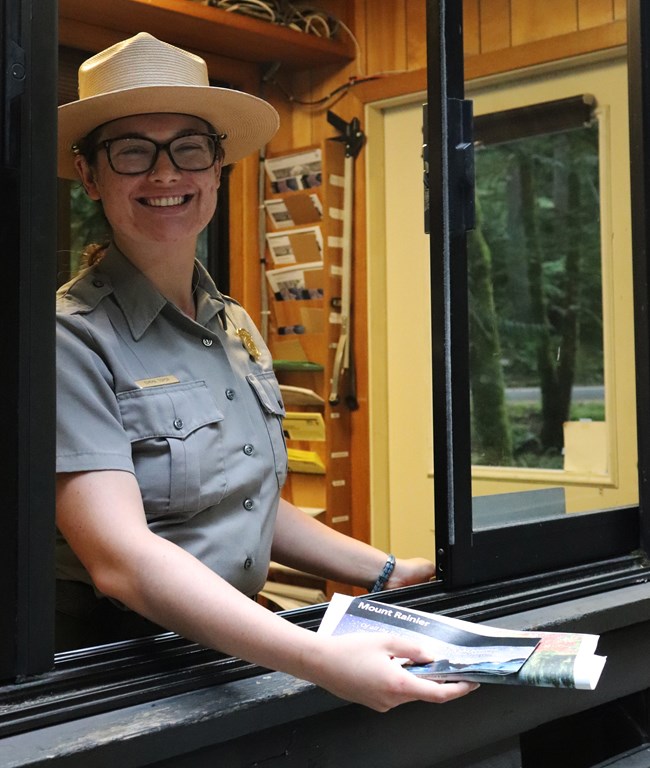
LU ANN JONES (HOST): Today, when you visit a national park -- no matter which park you visit -- you receive a brochure with entry. It’s a glossy, sturdy piece of paper, folded in half and quartered, with a thick black band running across the top.
Whether you’re visiting a desert park or a forest park, a glacier or a beach, these cultural and literal roadmaps to the parks articulate a unified system of land management.
But it wasn’t always like that.
I’m National Park Service Historian, Lu Ann Jones, and you’re listening to “A Sense of Place: Stories of Stewardship from the National Park Service,” a podcast series about the people who shaped the parks, and the Service.
Today: the hidden history of parks publications.

NPS
ED ZAHNISER (NARRATOR): I don’t know how to make this story short. [laugh]
JONES: That’s Ed Zahniser.
ZAHNISER: I’m a retired senior writer/editor for the publications group of the National Park Service.
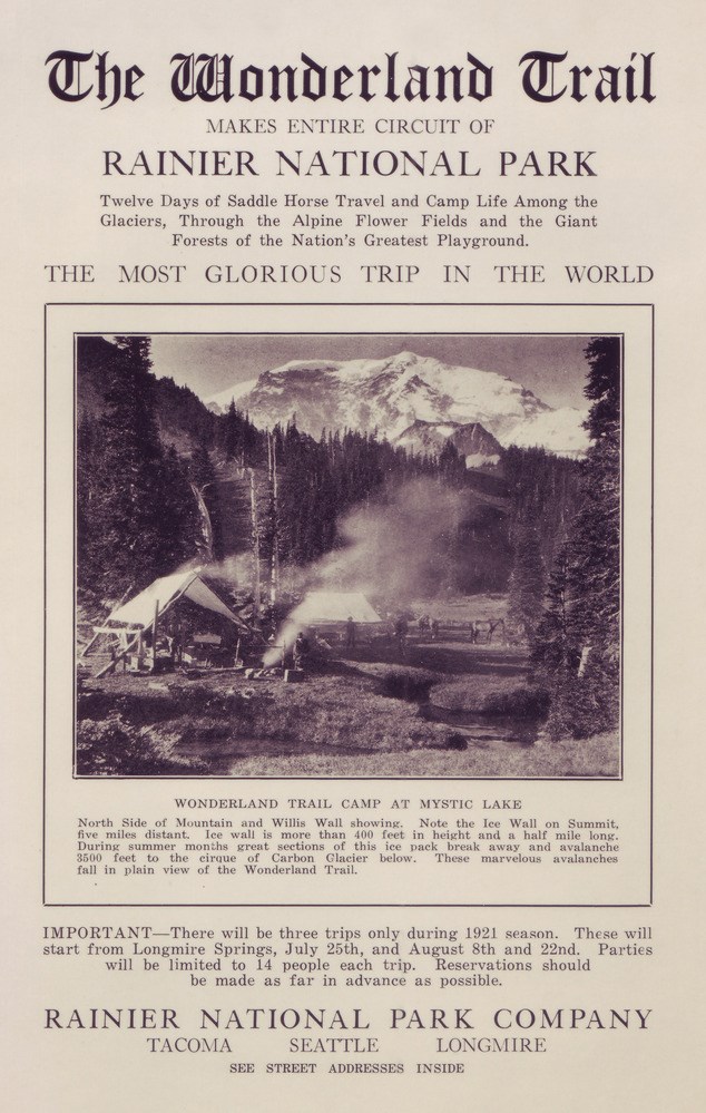
JONES: For almost as long as there have been national parks, there have been park brochures—but the earliest iterations were worlds away from the brochures we know today. The very first were created by the first park stewards, the United States Army in 1916, the year the National Park Service was born. Later, production was handed over to railroad companies, since most of the traffic to and from the parks was on trains.

Mount Rainier National Park Archives
Over the years, publications continued to evolve as the number of parks in the system grew—and grew. By the middle of the 20th century, there were over 250 parks. And each had its own brochure, with its own singular design.
For the publications department, it was a lot handle.
Something had to give.
The National Park Service began to reimagine publications as a system, rather than a collection of unique titles.
To articulate that system to the public—and keep up with the growing demand for publications— they needed standardization, in both the look and the voice of their print materials.
To meet those needs, in 1970 the National Park Service opened an Interpretive Design Center. For the first time, the parks’ various interpretive media functions – audiovisual, publications, museum exhibits – were located under one roof. Still, inefficiencies remained.
ZAHNISER: Shortly before I came, the protocol, I was told, was that the editors would write a manuscript and just sort of, in the parlance of publishing world, throw it over the transom to the designers, and they would lay that out as a brochure. And the size of the brochure would really depend on how long the text was or how short the text was. So they weren’t that involved in the concept.
They were, like, illustrating a piece of writing.
JONES: When Zahniser joined the office of publications at Harpers Ferry in 1977, the NPS was undergoing a cultural renaissance. They wanted to reach ordinary park visitors—folks who were curious about but not specialists in archeology or wildlife biology or geology or any of the myriad subjects explored in national parks. And revitalizing their publications was a big part of that mission. To do that, the publications office needed to make some changes: they needed a more efficient workflow; they needed a welcoming voice and standardized design; they needed Massimo Vignelli.
ZAHNISER: I thought that the best thing that ever happened to the office was Massimo Vignelli.
JONES: Modernist designer Massimo Vignelli had recently won acclaim for designing New York’s subway signage and maps. But the national park publication project presented the designer with a unique set of challenges. Chief among them was how to unite such naturally and culturally diverse sites under a single design standard, while still capturing what was special about each one.
His solution was misleadingly simple.

NPS
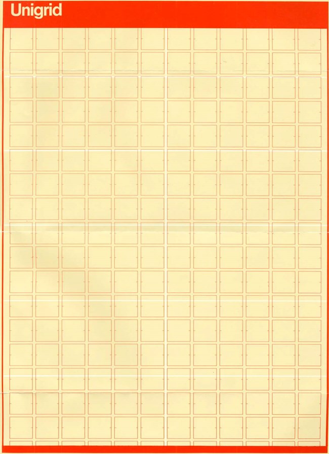
ZAHNISER: He established the idea of a design platform, and that the more gridded that platform was, the less time you spent wondering what size sheet of paper should we use, should it be horizontal, should it be vertical, should it be this wide or that wide? He established that for printing economy, but part of design is recognizing that you’re doing this on paper, and these papers go through presses, and presses are a certain size. So those sheets of paper were all standardized in width and modularized so you could have a narrow brochure, and it would be half of the whole sheet, and then you could have different lengths.
JONES: Vignelli’s modular grid system measured roughly 16 inches by 23 inches. Those dimensions allowed the Park Service to create brochures in ten different sizes and formats. A distinctive black bar at the top maintained a consistent look; inside this bar, the pamphlet or page title is set in white Helvetica typeface. And he called it unigrid.
ZAHNISER: We had this theory of thirds, which I think still stands: which is that anything you look at can be pleasingly divided, I mean, intellectually pleasingly divided into three parts, visually and intellectually.
JONES: The unigrid is not just another template. It is a comprehensive graphic design system that standardized formatting and production. It allowed the designers, writers, and cartographers to focus on content and creativity while conveying a strong visual identity for the agency. Perhaps most importantly, Vignelli’s unigrid concept allowed designers and editors to work together, to focus on visual and written content simultaneously.
ZAHNISER: So that set the stage, I think, for the writer and the designer and eventually the cartographer to really work together in advance of doing anything, to work together on what’s the story, how do we tell it, how do we divide it up.
I think Vignelli at least intuitively understood that a reader makes a preconscious decision when looking particularly at print. There’s a preconscious decision of whether or not this looks like I can readily read it, and today there are so many other options instantly available, that if you look at something and the type is too dense, you will move on. So, you’ve wasted whatever effort you put in, you know, big budget, into trying to communicate.
JONES: All this time and effort for the sake of communicating with visitors they would probably never meet. And that’s the job of the Service members at the Interpretive Design Center -- toiling behind the scenes to enhance the visitor experience, through engaging print materials like brochures and signs, and later, books.

NPS
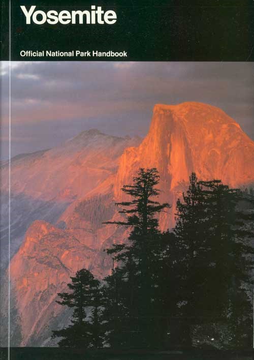
ZAHNISER: Vignelli was not a writer, but he was a genius designer, just no question, and a visual genius, too. Because in that Yosemite book, like we were talking before this interview about how we provided him with six hundred photographs. He came to our office to work on that book, and we started at about ten o’clock in the morning. So we had these six hundred photographs, and he went through a lot of the photographs. I had been working with the photographs for a couple of months, so I had a pretty good grasp of what they were and how they related to the different parts of the book that we were trying to present.
At around ten o’clock in the morning, I started showing him photographs. Well, like at three in the afternoon, he might say, “You remember that photograph you showed me?” And he could describe that photograph from five hours ago with enough precision that I, who was pretty familiar with the whole body of photographs, could find that photograph and hand it to him. Also, I watched him. Every once in a while, he would just stop and stare off into nothing, and I realized he’s going through every page in that book in his head.

NPS
So, what we got from him were little thumbnail drawings of each two-page spread in the book, little thumbnail gestures with his fat pen, but the gestures were so accurate that the designers could place all the photographs that we selected out to go with that thumbnail dummy. We started that book at ten a.m. and finished at midnight in the conference room. We just stayed in that office and worked that whole time.
We got the manuscript set in the typography of the book. So, as he was working on it, he was reading it, and I was in heaven, because he kept saying, “Wow, this is interesting. Did you write this?” No, he said, “Who wrote this?” I said, “Well, I wrote it.” He kept saying that, which that was great validation for me. But that was back in the days when we had time to work on those books, because there’s a lot of great stories attached to Yosemite if you have time enough to learn them and put them out.
JONES: Unigrid was adopted as a cost-saving endeavor, but it would end up changing the way the publications team approached their written interpretation efforts as well.
ZAHNISER: So, that started to help you think about telling stories, because most places have more than one story. A place like Yosemite it has a natural history, it has a human history, it has a National Park Service history, it has a controversy history, and it has, in my opinion, the most spectacularly concentrated, stupendous scenery that I’ve ever seen anywhere.
We eventually convinced Vince, our boss, Vince Gleason, that since an increasing amount of energy was going into design, and into refining the cartography, that we needed writing that came up to those sorts of standards of communication.
JONES: Before this publications department renaissance, most of the writers were scientists and research historians. They had their own agendas about what should be covered. And this created some tension.
ZAHNISER: We fought to present these natural parks, so to speak, as cultural places, because some of them had a cultural history that was greater than some cities. So that was a big breakthrough in treating parks holistically as a human experience, as natural experience, as humans as part of natural history, natural history as part of humanity.
I quickly realized that one of my jobs as an editor was to protect the readers from geologists and archaeologists, because they want to take people so far into the weeds--because they’re not thinking about the reader.

NPS
JONES: Ultimately, that’s what it’s all about. Serving the visitors. Creating materials that anticipate their needs and speak to their interests. Materials that echo the ethos of the National Park Service at large, and communicate with one voice:
The parks may be diverse, but the Service, that is singular.
ZAHNISER: I think somewhere you asked about, or maybe I made up my own question about, “How do you measure success?” For me, it was like I was out in Yellowstone, out of my car but at a viewing place or something, and there’s these people on bicycles and they’re reading the park brochure and reading it as a group, sort of. “Hey, did you read about this?
“Yeah.”
“Well, did you read about this?”
“Yeah.”
That’s success.
JONES: Over 25 years later, the NPS still uses unigrid for all its publications.
Ed Zahniser wrote and edited new unigrid park information brochures for many National Park System areas. They included Channel Islands, San Juan Island, Death Valley, Petrified Forest, John Muir, River Raisin, Bryce Canyon, and Yellowstone. Also, among his publications are national park handbooks on Apostle Islands, Assateague, Big Bend, Great Smoky Mountains, Yosemite, North Cascades, Yellowstone, Glacier Bay, and the U.S. Virgin Islands sites.
Ed retired in 2013, after 36 years with the National Park Service publications group at Harpers Ferry Center for media services.
This has been “A Sense of Place: Stories Of Stewardship from The National Park Service.” I’m your host, Lu Ann Jones. My colleague Betsy Ehrlich and I conducted this interview in November 2015 at Mather Training Center in Harpers Ferry, West Virginia. It’s part of our National Park Service oral history collection.
This episode was produced by Emma Courtland and Robin Miniter, with assistance from Marcelino Vialpando, for the National Park Service. Music by Blue Dot Sessions.
Discover More
- NPS Publications (Harpers Ferry Center)
- A Brief History of the Unigrid (Harpers Ferry Center)
National Park Service brochures came in all shapes and sizes before Massimo Vignelli created a standardized design for NPS publications in the 1970s.
Last updated: August 13, 2021

