From atomic bombs to zooplankton, from Ice Age migrations to 21st century immigration, Unigrid brochures are on the front lines of storytelling in the National Park Service.
For almost as long as there have been national parks, there have been visitor brochures. As the National Park System grew, so did the need for publications. They came in a wide variety of formats, fonts, and folding methods that made it increasingly difficult to keep up with demand.
In 1977 Publications Chief Vincent Gleason sought a more efficient and cost-effective approach. He enlisted the expertise of modernist designer Massimo Vignelli, who had recently won acclaim for New York subway signage and maps. The Unigrid was born.
The Unigrid is not just another template. It is a comprehensive graphic design system that standardizes formatting and production. It allows designers, writers, and cartographers to focus on content and creativity while conveying a strong visual identity for the National Park Service.
The Unigrid has been an agency institution for so long that we forget it was the disruptor of its time. In 1985 the Unigrid program received one of the first Presidential Design Awards from the National Endowment for the Arts, which noted, “The program fulfills the primary objective of a design system, reducing routine decisions so that effort can be concentrated on quality. The implementation of the program demonstrates sensitivity to the wide variety of subject matter and attention to the finest detail. It is an example to others and has already achieved international recognition.” In more recent times, digital technology has revolutionized the printing industry and transformed the way the Harpers Ferry Center Publications Office works.
Once a new Unigrid is developed, it is generally reprinted every year or two with changes as needed. The Publications Office prints on average about 20 million copies per year. Laid end-to-end, they would stretch across the continental United States, passing many of the more than 400 national parks that distribute them.
Unigrid Fun Facts
-
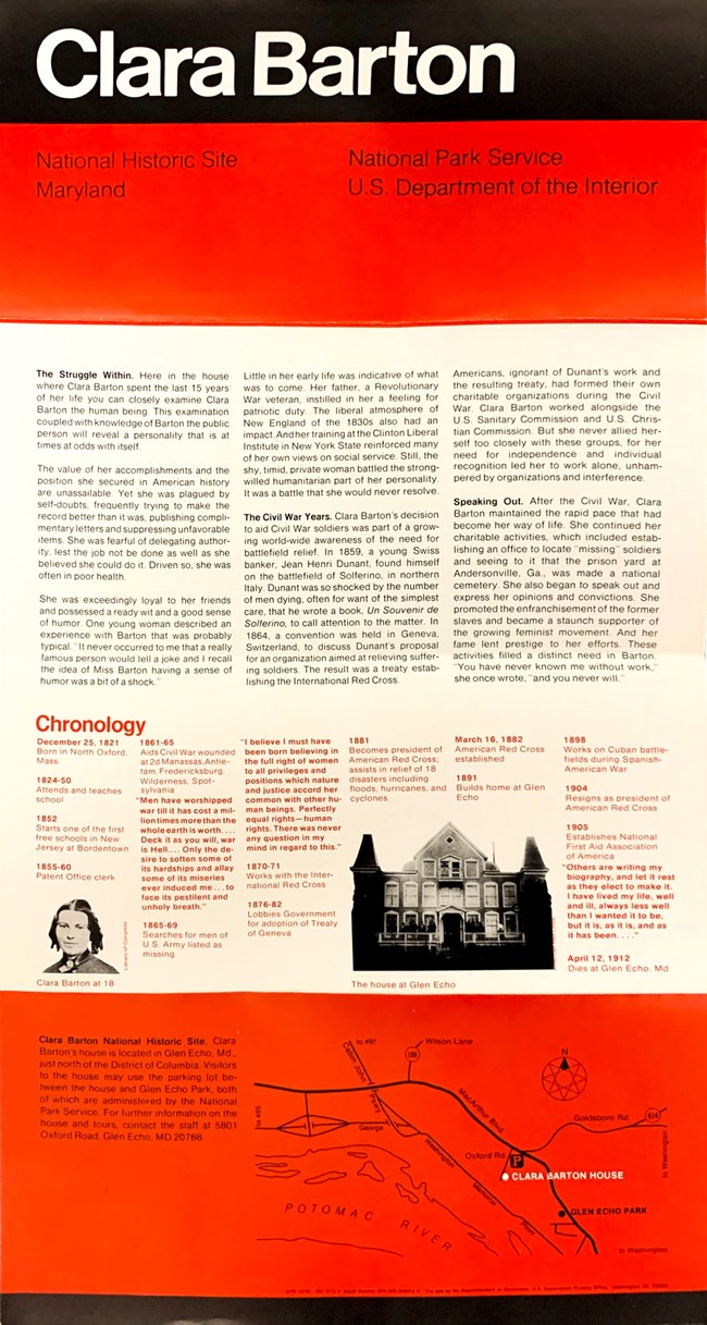
The 1978 brochure for Clara Barton National Historic Site was the first park brochure using the Unigrid.
-
A Unigrid’s basic building blocks are 4 by 8¼” panels defined by the fold lines.
-
The paper size can be one or two panels wide (“A” or “B” formats) and up to six panels long, allowing for a variety of shapes and sizes. These measurements are calculated to get the most out of a standard-size 25 by 38” press sheet, minimizing waste.
-
Paper, ink, and printing are all standard for the industry, allowing the government to buy in bulk from a single contract printer.
-
The original typefaces were Helvetica and Times Roman. Today’s standard typefaces are Frutiger and NPS Rawlinson.
-
The NPS Arrowhead first appeared in the black band in 1999.
-
A brochure’s print date appears in the GPO imprint, which is a line of small type that cites the Government Publishing Office (GPO), the year of the printing, and the year of origin or most recent major updates.
-
The underlying grid sets physical boundaries for individual elements yet allows for a great deal of flexibility. Two brochures of the same size and shape, even if they are designed by the same person, may look quite different.
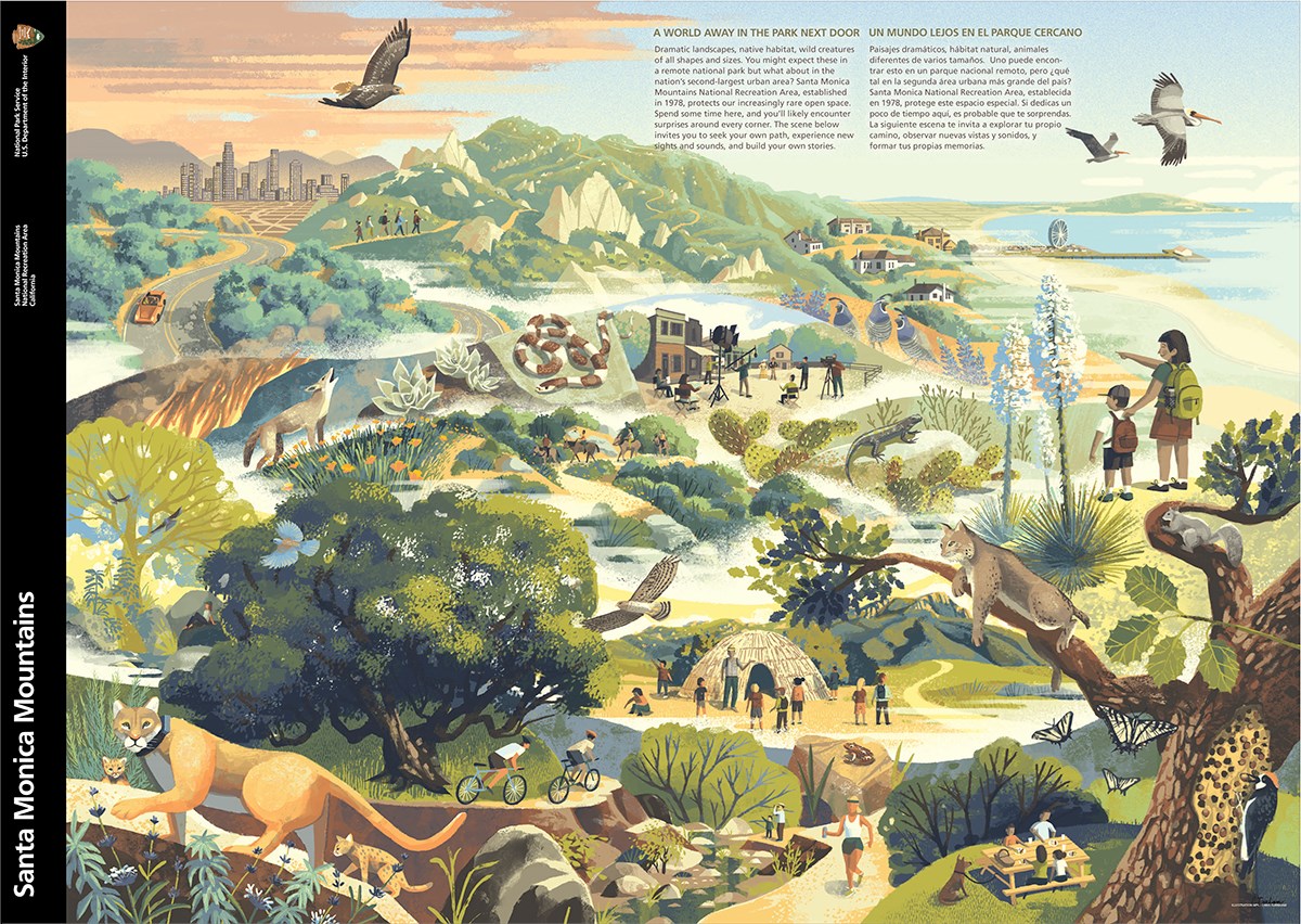
Early Unigrid designs stressed the underlying grid with graphics, text, and maps presented in a hierarchy of rows and columns. Later designs evolved into more integrated layouts with elements unified around the architecture of bold primary graphics and maps. Today, the grids, typographic treatments, editorial style, maps, and production methods continue to provide a recognizable consistency among all park brochures.

The underlying grid sets physical boundaries for individual elements yet allows for a great deal of flexibility. Two brochures of the same size and shape, even if they’re designed by the same person, will usually look completely different. Early designs stressed the “grid.” As the program evolves, designs are favoring the “uni,” unifying images, text, and maps into cohesive stories.
- Duration:
- 1 hour, 1 minute, 57 seconds
The HFC Publications office has been creating, and archiving, NPS Unigrid brochures since the system launched in 1977. Hear about the origins of the Unigrid, see some of the favorites from our collection, and share your favorites with us.
Last updated: March 10, 2023
