Part of a series of articles titled Intermountain Park Science 2021.
Article • Intermountain Park Science 2021
A Low-cost Air Quality Sensor for Measuring Particulate Matter
- Debbie Miller, Air Resource Specialist, DOI Regions 6, 7, 8; National Park Service (currently Environmental Protection Specialist, Air Resources Division, National Park Service)
Introduction
Clean air is essential for protecting human health and maintaining healthy ecosystems. Understanding the condition of the air resources in parks is critical for making informed management decisions. Although the NPS Air Resources Division operates an extensive network of air quality monitors at NPS units across the country, it is not feasible to monitor in every park. As a result, many parks in our region (which includes Department of Interior Regions 6 – 8, from Arizona east to Texas and north to Montana) do not have any air quality monitoring. The Natural Resources Division at the regional office has begun investigating the use of new, low-cost air quality monitors. One such inexpensive monitor is called the PurpleAir (made by PurpleAir LLC, Draper, Utah). The Division recently purchased one and deployed it near a reference monitor to see how well it would perform.
The PurpleAir measures particulate matter, which is comprised of very small particles and liquid droplets suspended in the atmosphere. Human exposure to particulate matter is associated with difficulty breathing, aggravated asthma, coughing, heart attacks, and other health effects. Monitors approved by the U. S. Environmental Protection Agency (EPA) for determining whether particulate matter is exceeding health standards are expensive to purchase and operate. The purpose of this evaluation was to see whether the PurpleAir monitor might be helpful in in determining whether air quality is of concern in parks that do not have a particulate monitor in or near the park.
PurpleAir Field Evaluation
Human activities result in the emissions of a wide array of pollutants that affect the environment in many ways. Particulate matter, which is comprised of extremely small particles suspended in the atmosphere, is harmful to human health and causes atmospheric haze that impairs visibility. The EPA has established national air quality standards for particulate matter that fall into two size classes: PM10 (particles < 10 micrometers [µm] in size) and PM2.5 (particles <2.5 µm in size). The smallest particles (PM2.5) can be inhaled deep into the lungs, making them especially harmful, while larger particles (between 2.5 and 10 µm in size) can cause irritation of the eyes, nose and throat. Particulate matter can cause breathing difficulties as well as other health impacts. EPA has set two health-based standards for PM2.5, based on an annual mean value and a 24-hour value (EPA 2019). The annual mean, averaged over 3 years, must not exceed 12 micrograms per cubic meter of air (µg/m3), and the annual 98th percentile of all 24-hour mean values, averaged over a three-year period, must not exceed 35 µg/m3. Sources of PM2.5 include windblown soil, diesel soot, wildland fire smoke, and gaseous pollutants (from vehicles, industry, etc.) that transform chemically into particulates in the atmosphere.
NPS photo/Debbie Miller.
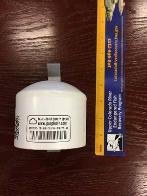
The PurpleAir is a small, inexpensive device for monitoring atmospheric concentrations of particulate matter. While state-of-the-art monitors approved by EPA to monitor particulate concentrations for compliance with national air quality standards can cost $10,000 and up, the PurpleAir costs around $260. In addition, EPA-approved monitors require regular maintenance and calibration to operate and usually need to be housed in a climate-controlled shelter. The PurpleAir is a self-contained unit that requires only access to line power and a WiFi network in order to operate (Figure 1).
The PurpleAir contains two small, identical laser particle counters; having two sensors helps to verify that the unit is functioning properly. The PurpleAir counts the numbers of particles in several size classes and converts them to estimates of mass concentration. In addition to PM2.5 and PM10, the PurpleAir reports the concentration of particles less than 1.0 µm in diameter, called PM1.0. The PurpleAir also measures temperature and relative humidity.
The particle counters in the monitor use assumptions about the average particle density in order to convert the particle counts to mass. This means that the reported particulate concentration can vary depending upon the mixture of particle types found in a particular area. The PurpleAir monitor reports two different particulate concentrations for each size class (Sayahi et al. 2019). According to the PurpleAir website, the manufacturer of the particle counters uses two different algorithms to convert the particle counts to mass concentration, labeled as CF_1 or CF_ATM (PurpleAir 2020). The PurpleAir uses an assumed particle density for indoor air for the CF_1 measurement and an assumed particle density for outdoor air for the CF_ATM measurement. For some earlier PurpleAirs these measurements were not labeled correctly, so it is important to check them to be sure which PM2.5 measurement you are using (Barkjohn et al. 2020). For this evaluation, I used the lower of the two measurements, which is the CF_ATM measurement.
Installing the PurpleAir monitor is straightforward. The monitor can be placed out in the open, although it is a good idea to place it under cover if possible, such as under the eaves of a roof. Once it is mounted on a vertical surface or pole, the monitor is connected to a WiFi network. You can view the data immediately on the PurpleAir website (https://www2.purpleair.com/) (accessed January 19, 2021) or download it from the web site in a file. The PurpleAir website includes a mapping application where users can view their own PurpleAir data as well as data from other available PurpleAirs in real time. PurpleAir monitors can also be purchased with a micro SD card that records data for manual data retrieval in case a WiFi network is not available. The PurpleAir used for this evaluation reported a concentration measurement once every 80 seconds.
NPS photo/Debbie Miller.
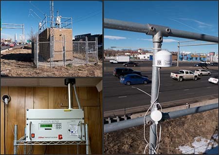
The regional air program recently deployed its PurpleAir monitor in downtown Denver at a monitoring station operated by the State of Colorado. The site is located next to Interstate 25 (I-25) and therefore experiences relatively high particulate concentrations. The station employs a GRIMM Model 180 particulate monitor along with meteorological and other instruments. The GRIMM is approved by EPA for use in determining whether air quality meets national air quality standards, providing a good reference against which to compare the PurpleAir data. The GRIMM data were assumed to be accurate measurements of PM2.5 concentrations. The PurpleAir was placed on the top of the shelter at the I-25 monitoring location, where it collected data from November 2, 2018 to March 8, 2019 (Figure 2).
The station experienced a power interruption about midway through the monitoring period, causing the PurpleAir to lose the network connection for an extended time. During this time the data could not be uploaded to the PurpleAir website. Data were retrieved at the end of the monitoring period from the micro SD card inside the monitor rather than the web site. The data were analyzed using SAS software and hourly average values were calculated. The review did not include the PM10 data because previous evaluations performed by others, such as the South Coast Air Quality Management District in California (SCAQMD 2019), have suggested that the PurpleAir does not perform as well for PM10 monitoring as it does for PM2.5. The smaller particles also have a greater impact on human health and visibility impairment.
To evaluate the PurpleAir data, I first compared the measurements from the monitor’s two internal sensors against each other and found that the data matched reasonably well. In addition, I compared the NPS PurpleAir data to measurements collected by another PurpleAir that was also located at the I-25 monitoring site. The data between the two different PurpleAir units also agreed reasonably well. These two comparisons suggest that the PurpleAir’s two internal sensors performed consistently with each other and were comparable to another separate PurpleAir monitor.
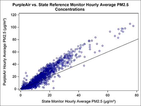
The NPS PurpleAir hourly average PM2.5 concentrations were then compared with hourly averages reported by the GRIMM, which served as the reference monitor. The Colorado Air Pollution Control Division provided the GRIMM hourly averages (Colorado Department of Public Health and Environment-Air Pollution Control Division, B. Rink, Technical Services Program, email, 28 March 2019). In general, the hourly averages from the two monitors are highly correlated (Figure 3), with r=0.96, but the PurpleAir concentrations were often higher than those reported by the state reference monitor. Measurements that agree exactly between the two monitors would lie along the 1:1 line in Figure 3. The farther the data points are from this line the less agreement there is between the two sets of measurements. The large number of points in this plot above the 1:1 line shows that the PurpleAir’s readings are frequently higher than those from the reference monitor.
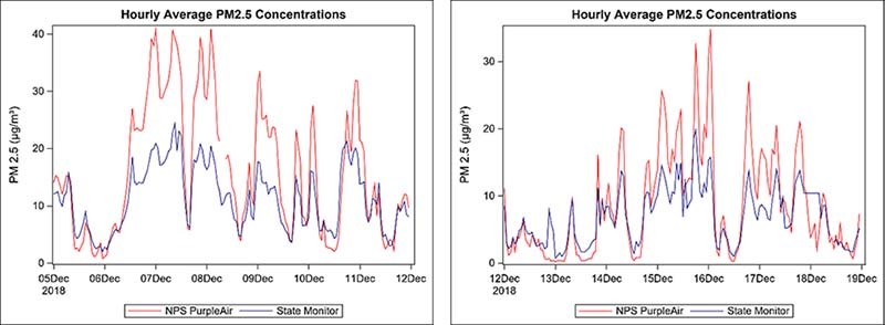
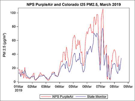
However, the PurpleAir frequently reported PM2.5 concentrations that were substantially higher than those reported by the GRIMM, sometimes by a factor of two. This tendency was more pronounced at higher ambient PM2.5 concentrations. Figure 5 shows a time series plot of the PurpleAir and GRIMM data during the first week of March 2019, when the Denver area experienced periods of elevated PM2.5 concentrations for approximately three days. Although the PurpleAir data tracked the changes in fine particulates reported by the state monitor reasonably well, the PurpleAir measurements were consistently higher than the GRIMM data. For example, when concentrations reached 77 µg/m3 on March 7th, the PurpleAir reported a concentration over 100 µg/m3.
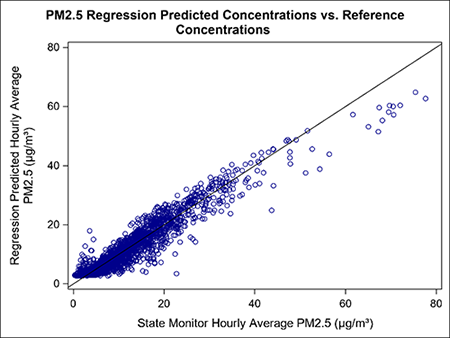
One way to try to improve the PurpleAir monitoring data is to adjust it using a mathematical correction. In this case, I used linear regression to develop an equation to relate the PurpleAir data to the GRIMM data. While mathematical corrections have been developed by others in other parts of the country, the resulting equations can differ depending on the monitor’s location and local particulate mass composition, so I felt it would be useful to develop an equation in the Denver area for this particular monitor. The regression equation I obtained is PM2.5 (µg/m³) =0.589*PurpleAir+2.60, with an R2 of 0.91. The predicted hourly PM2.5 concentrations obtained from the regression are plotted against the GRIMM reference data overlayed with a 1:1 line in Figure 6. The regression improves the measurements from the PurpleAir by reducing the tendency of the predicted hourly concentrations to be too high, but it results in a tendency to under predict, particularly for higher ambient concentrations. In addition, an examination of the plot as well as the regression residuals suggests that the relationship between the monitors is not quite linear.
Some of the regression relationships developed by other agencies are available on the PurpleAir website. The PurpleAir online map provides options to adjust the displayed concentrations using one of three different regression equations. One was developed by the University of Utah (Sayahi et al. 2019) and another was developed by the Lane Regional Air Protection Agency (LRAPA) in Oregon (LRAPA 2020). EPA has been working on a nation-wide correction equation (Barkjohn et al. 2020) and it was recently added to the PurpleAir online map as well. The South Coast Air Quality Management District in California also conducted an extensive evaluation using several PurpleAirs and reference monitors, including a GRIMM optical particle counter, and has reported their results online (SCAQMD 2019).
Another way to evaluate the PurpleAir data is to group them according to the air quality index (AQI) category as measured by the reference monitor. The AQI is an index used by the EPA to help translate measurements from different types of monitors into levels that describe the human health concern (EPA 2014, EPA 2020). This provides a more meaningful way to inform the public about current air quality conditions than raw monitor values. Concentrations are categorized as Good, Moderate, Unhealthy for Sensitive Groups, Unhealthy, Very Unhealthy, and Hazardous (Figure 7). Sensitive groups include older adults, people with lung disease, children, and people who are active outdoors.
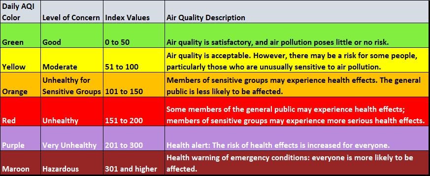
Figure 7 describes the different categories of the air quality index, including each category’s level of concern, range of index values, and a description of the air quality.
- The first row or Green category’s level of concern is good, the range of index values is 0 to 50, and the air quality description is: “Air quality is satisfactory, and air pollution poses little or no risk.”
- The second row or Yellow category’s level of concern is moderate, the range of index values is 51 to 100, and the air quality description is: “Air quality is acceptable. However, there may be a risk for some people, particularly those who are unusually sensitive to air pollution.”
- The third row or Orange category’s level of concern is unhealthy for sensitive groups, the range of index values is 101 to 150, and the air quality description is: “Members of sensitive groups may experience health effects. The general public is less likely to be affected.”
- The fifth row or Red category’s level of concern is unhealthy, the range of index values is 151 to 200, and the air quality description is: “Some members of the general public may experience health effects; members of sensitive groups may experience more serious health effects.”
- The sixth row or Purple category’s level of concern is very unhealthy, the range of index values is 201 to 300, and the air quality description is: “Health alert: The risk of health effects is increased for everyone.”
- The seventh row or Maroon category’s level of concern is hazardous, the range of index values is 301 and higher, and the air quality description is: “Health warning of emergency conditions: everyone is more likely to be affected.”
One question of interest is whether one would be able to correctly determine the current AQI category for PM2.5 using the PurpleAir data. I computed running 24-hour PM2.5 concentration averages for both the PurpleAir and the GRIMM data and assigned them to the appropriate AQI categories. I used only periods with no missing values to compute the 24-hour averages, which gave me about 2300 24-hour averages for comparison. The category assignments based on the two monitors agreed 79% of the time, but the PurpleAir category was too high about 20% of the time, while it was rarely too low (0.2% of the time). In addition, in just over 30% of the instances where the PurpleAir’s AQI category was too high, the PurpleAir-derived category indicated PM2.5 concentrations were above health standards (either Unhealthy for sensitive groups or Unhealthy), when the actual category should have been one indicating concentrations were within the health standards (Good or Moderate). Since it is the higher concentrations we are usually most interested in identifying, these results suggest that the PurpleAir is not a good tool for evaluating whether there is a health risk from particulate matter.
Conclusion
Given the size and very low cost of the PurpleAir monitor, I was impressed with how well it performed during this evaluation. It is also relatively easy to set up and use, and it can be used without access to the internet as long as the monitor includes a micro SD card. The PM2.5 hourly concentrations were highly correlated with those from the reference monitor, and the PurpleAir monitor did a surprisingly good job of tracking the changes in concentration. However, the data collected indicate that the monitor has a tendency to report values that are too high, particularly for higher ambient concentrations, and there is a fair amount of spread in the data. This study was limited in time and the range of concentrations that were observed, so it is not possible to say from this evaluation alone how consistently other PurpleAirs might perform, how reliable they are in the long term, or whether their accuracy might change over time.
Given the tendency of the PurpleAir to overestimate concentrations, a PurpleAir monitor by itself is not really a good tool for determining whether or not air quality is meeting air quality standards at a specific time, or for use as part of a public health advisory program. However, in the absence of an EPA-approved monitor, a PurpleAir can function as an inexpensive survey monitoring tool to answer some types of air quality questions a park might have. Examples of questions PurpleAirs might help to answer are:
-
Are PM2.5 concentrations high enough to warrant closer examination with a more accurate monitor?
-
Are there changes in average PM2.5 concentrations over time?
-
Are there patterns in the variation of PM2.5 concentrations over time, such as changes with the time of day or season?
-
Do changes in PM2.5 concentrations correlate with other available data, such as local wind patterns?
-
Are average PM2.5 concentrations different from one area of a park to another?
A PurpleAir monitor can be a useful survey tool if one is aware of the monitor’s limitations and carefully considers what the monitor will be used for before deploying one. If possible, it is a good idea to calibrate a PurpleAir by placing it near a near a reference monitor for a while to see how the monitor responds in a new area. As the number of PurpleAir users continues to increase, it may be possible to find a correction factor that has been developed nearby, and the EPA has recently developed a correction for use nationwide. The regional air resources program and the Air Resources Division are also available to provide park staff with technical assistance.
References
Barkjohn K. K., A. L. Holder, S. Frederick, and A. L. Clements. 2020.
PurpleAir PM2.5 U.S. Correction and Performance During Smoke Events. International Smoke Symposium, April 21, 2020, Raleigh, NC. Available at: https://cfpub.epa.gov/si/si_public_file_download.cfm?p_download_id=540979&Lab=CEMM (Accessed October 8, 2019).
Holder, A. L., A. K. Mebust, L. A. Maghran, M. R. McGown, K. E. Stewart, D. M. Vallano, R. A. Elleman, and K. R. Baker. 2020.
Field Evaluation of Low-Cost Particulate Matter Sensors for Measuring Wildfire Smoke. Sensors 20:4796.
Lane Regional Air Protection Agency (LRAPA). 2020.
LRAPA PurpleAir Monitor correction factor history. Available at: https://www.lrapa.org/DocumentCenter/View/4147/PurpleAir-Correction-Summary (accessed July 16, 2020).
PurpleAir. 2020.
What is the difference between CF_1 and CF_ATM? Available at: https://www2.purpleair.com/community/faq#!hc-what-is-the-difference-between-cf-1-and-cf-atm (accessed September 21, 2020).
Sayahi, T., A. Butterfield, and K. E. Kelly. 2019.
Long-term field evaluation of the Plantower PMS low-cost particulate matter sensors. Environmental Pollution 245:932-940.
South Coast Air Quality Management District (SCAQMD) Air Quality Sensor Performance Evaluation Center.
Field Evaluation Purple Air (PA-II) PM Sensor. Available at: https://www.aqmd.gov/aq-spec/product/purpleair-pa-ii (accessed May 8, 2019).
U.S. Environmental Protection Agency (EPA). 2014.
Air Quality Index: a guide to air quality and your health. EPA-456/F-14-002. Available at: https://www3.epa.gov/airnow/aqi_brochure_02_14.pdf (accessed July 27, 2020).
U.S. Environmental Protection Agency (EPA). 2019.
NAAQS table. Available at: https://www.epa.gov/criteria-air-pollutants/naaqs-table (accessed May 21, 2019).
U.S. Environmental Protection Agency (EPA). 2020.
AQI Basics. Available at: https://www.airnow.gov/aqi/aqi-basics/ (accessed September 10, 2020).
Acknowledgments
I wish to thank John Olasin and Bradley Rink with the Colorado Air Pollution Control Division for their invaluable assistance with the PurpleAir evaluation. I also wish to thank John Vimont and Dr. Barkley Sive of the NPS Air Resources Division for reviewing and commenting on this article.
Tags
Last updated: August 6, 2021


